This Page is Under Construction
Three months and twenty-odd posts in, I’ve run through the first group of “polished” drafts that I had converted from old notes. So I thought I’d take a minute to talk about how I assembled this site.
 Image by QuinceCreative, Pixabay License.
Some Assembly Required
The blog is pieced together from disparate tools and resources:
- Blot.im is $4/month. It includes the subdomain and support has been very good.
- Blot needs Dropbox, git, or Google Drive as a backend. I use Dropbox.
- Comments are by cusdis, an ad-free, light-weight Disqus alternative. I have one complaint, which is that there is no mechanism to send a follow-up email. You can host it yourself, but you can also use the dev’s hosted service for free.
- For analytics,1 I use goatcounter, which gives me statistics but doesn’t “track” users. Like cusdis, this is also an open-source tool with a free non-commercial hosted service. However, my own ad-blocker tends to interfere with it, so it’s not a perfect system.
- Feed Informer is free for a blogroll for under 50 feeds. Trimming down my list was a hard job!
- Other graphical resources are taken from all over. The logo is from game-icons.net, the palette from lospec. Some other icons were from feather.
The Process
As I write, I’ve settled into a pretty simple workflow.
- Most of my first drafts and ideas are done in Google Keep. It’s not perfect, but it’s handy. I also hear good things about Obsidian.
- I use Kate for editing and refining the text, which is fine. (It can get a little confused at nested markdown syntax and highlight it incorrectly.) At the same time, I keep the blot-generated preview open so I can see the final appearance. It’s not a perfect system but it’s OK. There are many “first-class” and WYSIWYG markdown editors, and I just haven’t investigated them yet.
- I read the text aloud to myself. This is a tried-and-true method for catching typos, errors, odd sentence constructions, half-thoughts, and so on. It really works!
- While Kate has spell-checking, I’m prone to ignoring red underlines while I write. Passing a post through GNU aspell as a discrete step forces me to evaluate all the odd words and possible typos in the post.
- As much as I can, I follow all the links in the post to be sure they work. If I’m working too far into the future, it can be difficult to check links to my own scheduled posts, so I try to do this again after the post goes up.
- This is more aspirational than true, but I also try to apply consistent tags, and to this end I have a list of tags and labels that I check each post against before finalizing it.
- I have a file in my drafts, “index.txt,” that I use to keep track of ideas, scheduling, and other TODOs. It’s not an ideal system, but it’s not that complicated a process either.
The Style

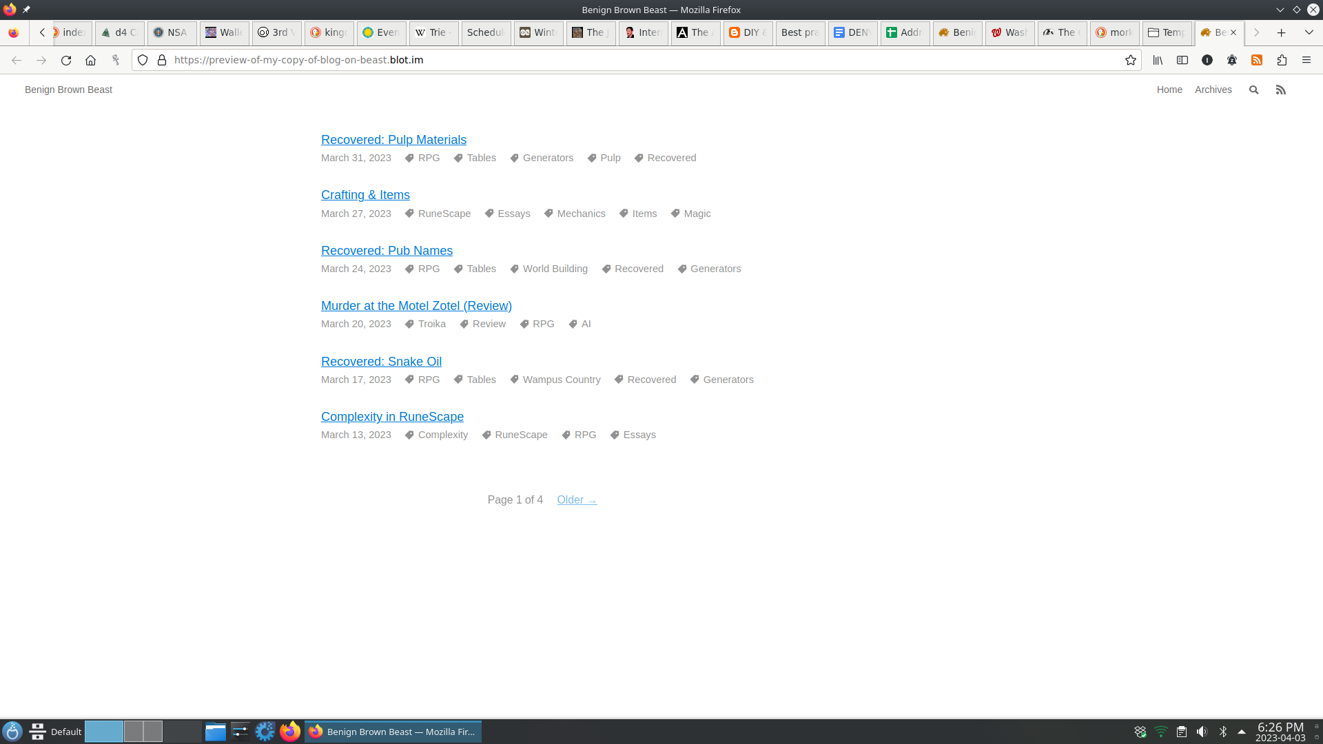
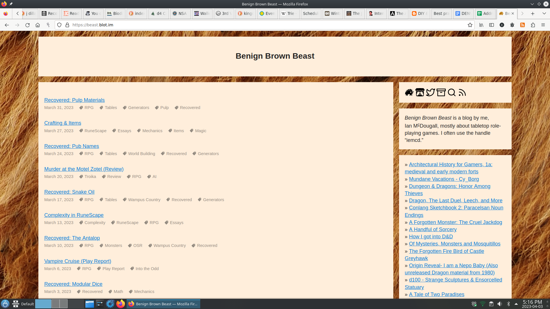
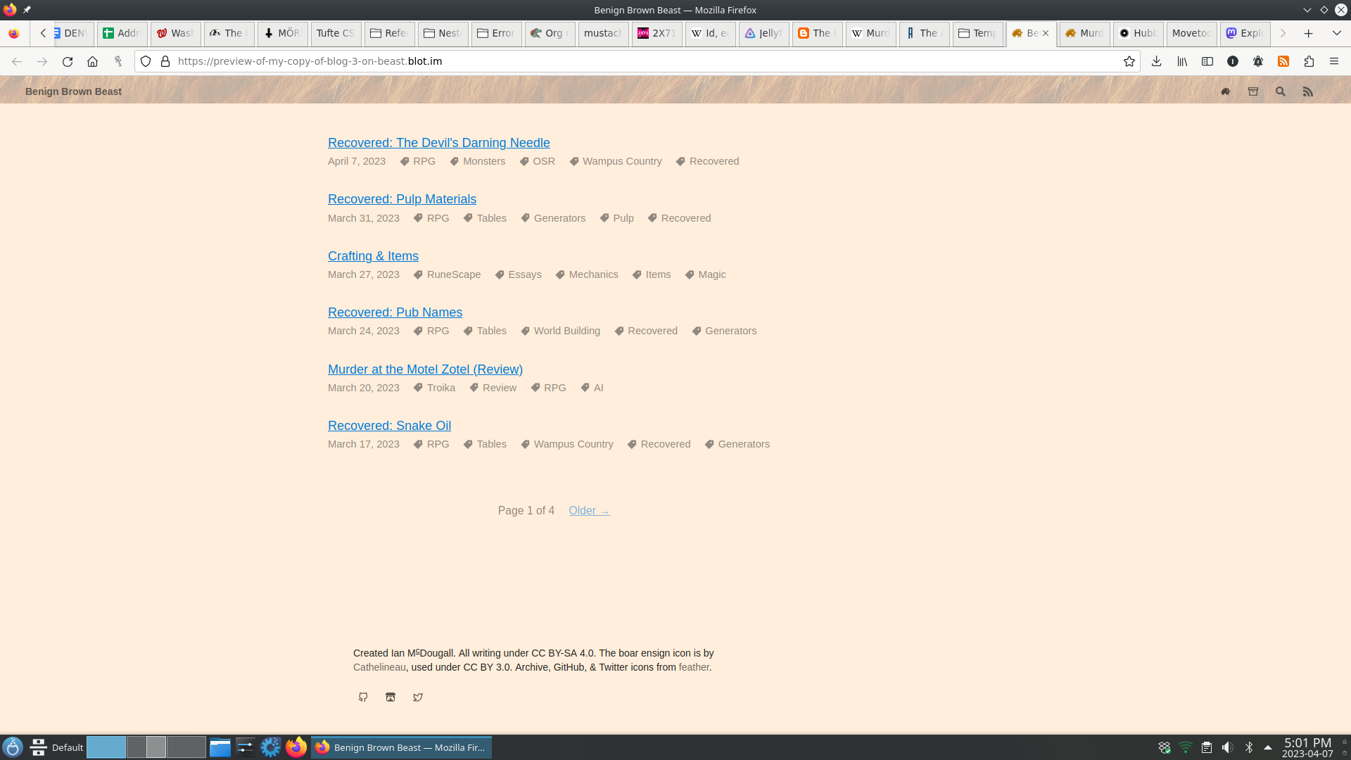
The built-in “blog” style from blot is clean and functional and modern and does all the things I need it to. I tried to make it a little more “Web 1.0,” without sacrificing any of these modern amenities. I had help and inspiration from Emmy Verte and borrowed CSS liberally from all over the internet. It was truly beautiful.

Unfortunately, it didn’t quite pan out: things like large tables and long equations would run off the sides of the text area without scroll bars, and I heard (and believed) that it was difficult to navigate on mobile. The part of me bothered by these minor issues is stronger than the part of me that wants a tiling background, and I reverted to a style closer to the original “blog” style. But I tried to keep some of the touches I liked most from this experimental step.

There are some things I’d still like to change:
- Image aspect ratios should be “capped” at 1:1. It’s jarring to me when I scroll and an image takes up the whole screen as I go past it.
- The “backgrounds” of the text entry fields should be a lighter color so they stand out, both in the comments section and in the site search.
- I might play with list striping, horizontal rules, and other smaller stylistic flourishes.
- The blogroll needs a better home than “under my own posts on the homepage.”
- For some reason the new layout doesn’t embed in Discord, although other platforms seem OK.

Ultimately, while I think the Web 1.0 style may have been a failed experiment, I’m hoping to carry some Web 1.0 spirit forward into this project, so expect occasional tweaks and changes.
Why have analytics? I think I just expected them because Blogger had them built-in. I haven’t gained many great insights yet, mostly just expected things: posts are most popular the day they come out and then views drop off sharply over the next week before becoming effectively nil. The more places I share a post (generally different Discord servers) the more people visit it. Sharing to Twitter also helps. People like reviews and play reports. Most of my readers are in the US. And so on. As the blog ages, I expect other patterns to emerge gradually, but maybe not. Perhaps the time of blogrolls and feed readers and cross-posting and link-following is ended.↩︎