Murder at the Motel Zotel (Review)
Warning: this review is going to talk about AI art, but please don’t run! I promise I’m trying to be thoughtful about it. I believe I have avoided any significant spoilers for the adventure itself.
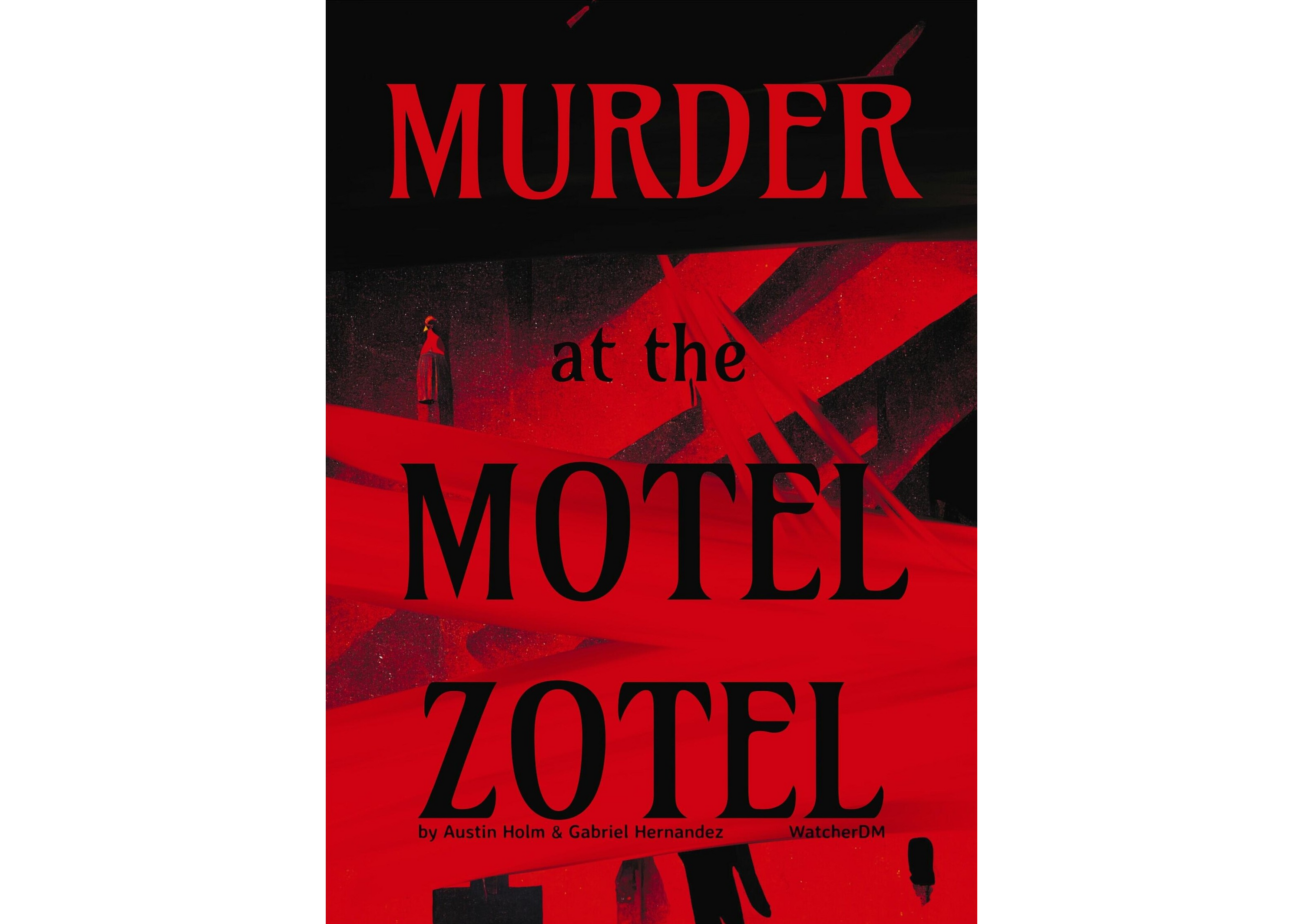 Murder at the Motel Zotel by Austin Holm & Gabriel Hernandez, edited by Alyssa Yeo
Murder at the Motel Zotel is a 32-page gonzo neo-noir investigation for Troika! set in a fantastically run-down motel. It’s available as a PDF for $20 on itch.io, but until April 7th, you can get it in the TTRPGs for Trans Rights in Florida bundle for only $5, along with a huge amount of other good stuff.
The Adventure as a Product
Murder at the Motel Zotel is a fully-featured Troika! supplement, with adversaries, items, character backgrounds, and locations. My biggest complaint about this is that it copies the “house style” of Troika! without considering its implications.1 The Troika! core book has a section for items, so the three new items in the book get their own one-page section, even if they might make more sense somewhere else. Troika! puts each background on a page by itself, with a narrow illustration alongside and white space at the bottom, so that format is reproduced here. But many of the backgrounds, as extensions of the adversaries, could maybe have been combined, or presented nearer to each other or hyperlinked.
This formatting exacerbates my other complaint about the text, which is that it’s relatively complicated. In part this results directly from the neo-noir genre. The narrative has a lot of moving parts, including management, the law, six rival gangs, the shop across the street, and the PCs themselves. But because the information is spread out across the book, sometimes duplicated and sometimes interrupting itself, I needed to read the whole thing twice before it all fell into place. (At least it’s short.) If the players are going to start with any of the backgrounds in the book, it may be best to excerpt the descriptions of related NPCs for context.
The Product as an Adventure
The adventure is appealing, either as a one-shot or dropped-in to a longer campaign. The absurd aspects capture the feeling of Troika, but the aesthetic could fit just as easily into Bastion. The factions are efficiently outlined with gimmicks, plans, and motivations. The motel is a bare framework to hang the plot off of, and the plot is relatively minimal, but it’s functional and there’s enough dynamics at play that this is a feature. I have confidence that I could run this well with minimal prep and have fun doing it.
It invites comparison to Blancmange and Thistle simply by being a Troika! adventure set in a hotel. I have run Blancmange, and I think that Motel Zotel is stronger in most respects. It has a traditional story hook for the players (a large cash reward, a compelling mystery), and a tone that requires less background and buy-in but still manages to be weird. Future adventures after Motel Zotel are driven by the characters’ actions in a way that they aren’t in Blancmange. It feels more alive. My only reservation is the amount of combat assumed, and that may just be a matter of taste.
The Art
There are four kinds of art in the book:
- Character portraits in the style of Dirk Detweiler Leichty, I believe by Gabriel Hernandez.
- Scribbly line-drawing spot illustrations, I believe also by Gabriel Hernandez.
- The two-page spread detailing the shop across the street, definitely by Gabriel Hernandez.
- Full-page and half-page illustrations throughout by the Midjourney AI.
This was my first time encountering AI art used in the wild, and I found it quite distracting, so I thought I’d take some time to unpack that.
I’m not going to deal here with the larger ethical implications of AI art. How is the training data licensed? What will happen to artists displaced by this technology? These questions are tackled elsewhere. For Motel Zotel’s part, at least, I think the “supplemental illustrations” approach is a reasonable and responsible experiment with the technology.
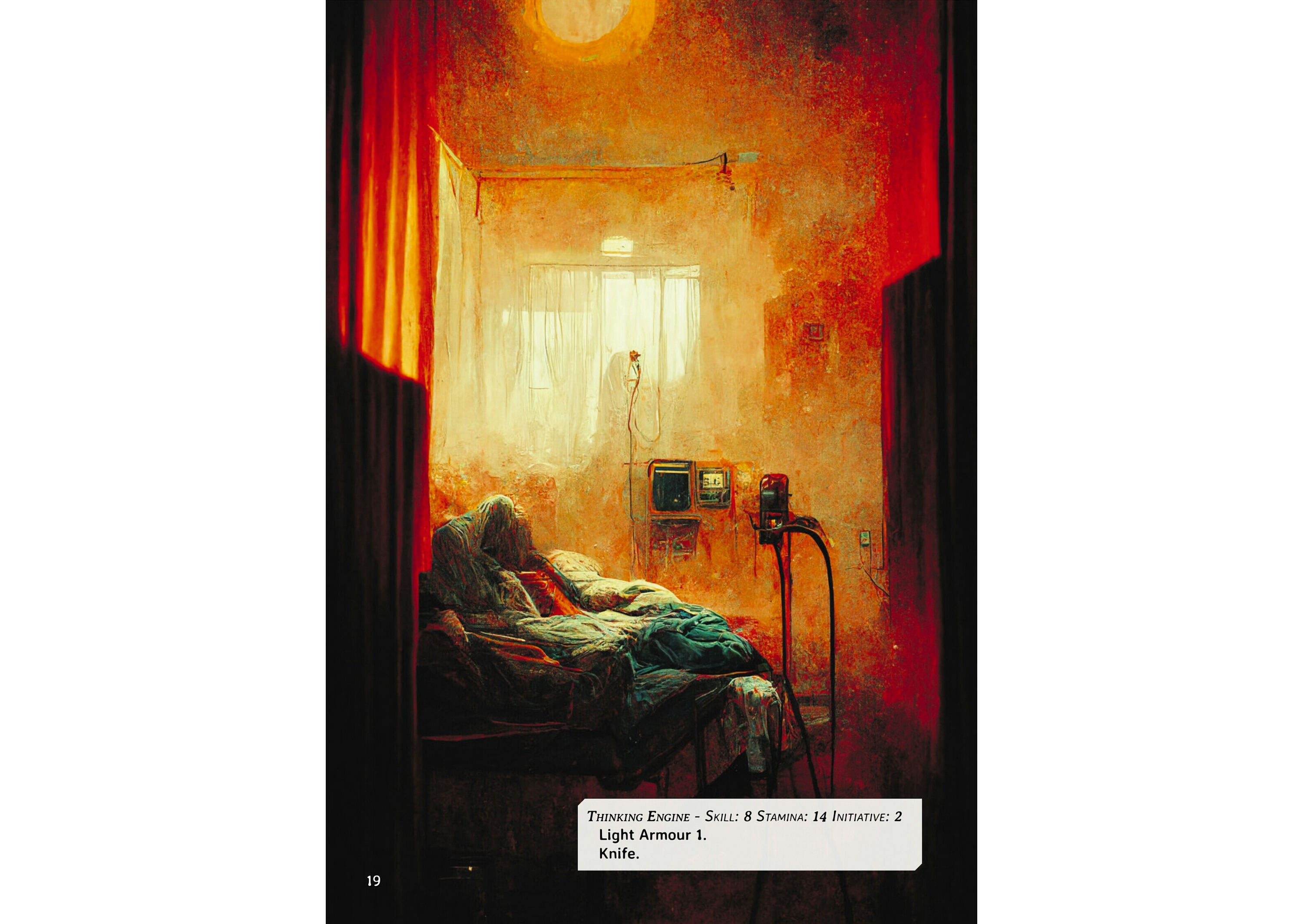 An example of AI art from the Motel Zotel.
But I also think it’s a failed experiment, and that it detracts from the book. I mentioned above that the book never felt cohesive to me, and I think part of that is the jarring way the Midjourney art is incorporated. It is mostly placed, sharp-edged dark rectangles, on sparse white pages, like figures in a scientific paper. A few full-page illustrations invert this: the page filled by muddy architecture with bright little rectangles carved out, like crude windows.
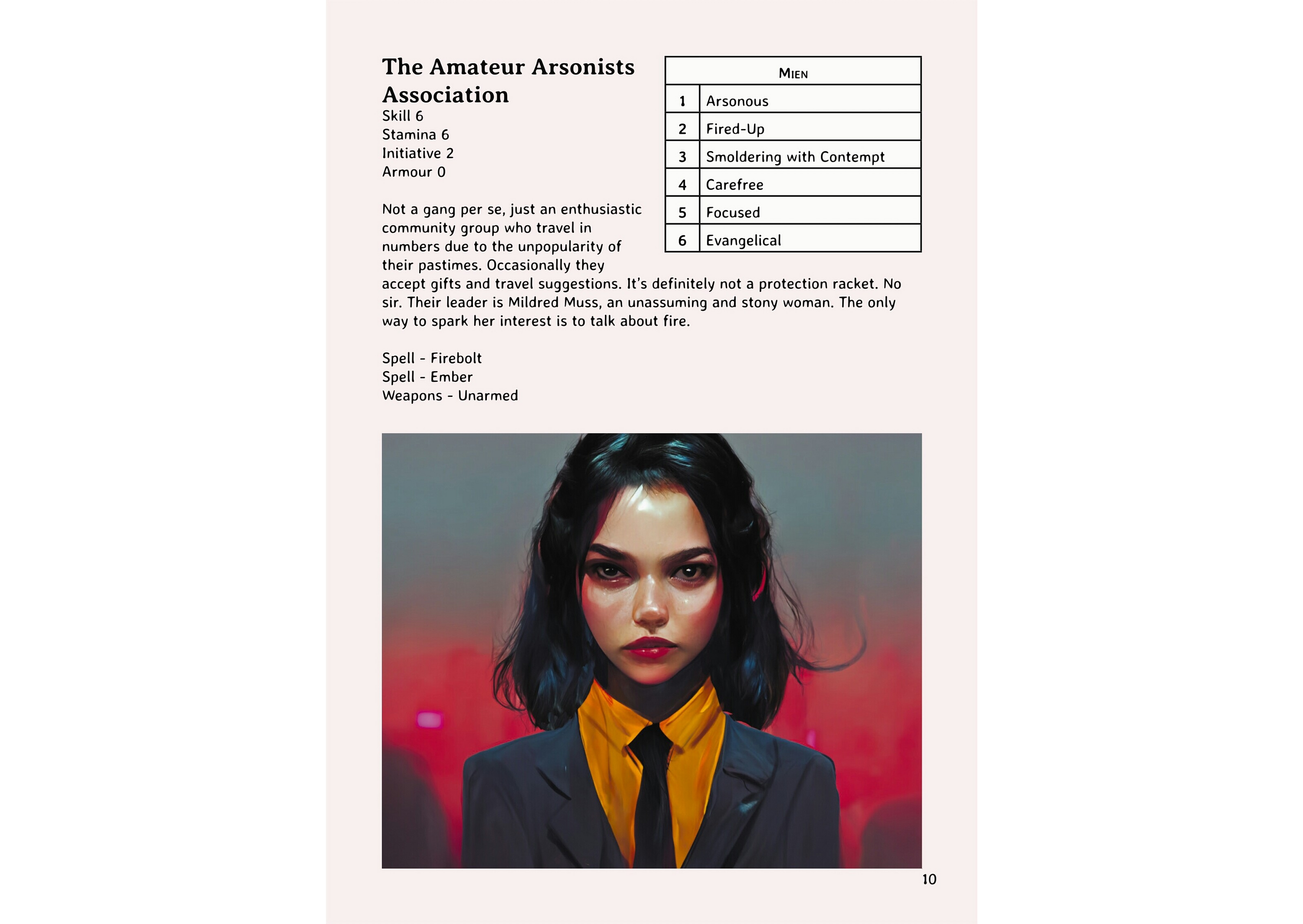 A typical use of Midjourney art in the Motel Zotel.
Some of this is a layout complaint. But I also don’t think the art is serving a purpose. Consider this illustration, introducing us to the Amateur Arsonists Association. It tells us so little. I can read into it if I try, and extrapolate an explanation for the art. But it doesn’t communicate anything that I don’t bring to it. It’s a young woman in a suit, perhaps the suggestion of a fire in the background. Any leftover detail is the most likely version of that fact. She’s wearing orange, the color of fire. Perhaps her face is slightly burnt? I can’t guess at the prompt that generated it, but I doubt that I have learned more than the words put into it.2 And yet, with its strong contrast and stark corners, it unhelpfully demands your attention.
What Next?
I think this product would have been stronger without the Midjourney art, but clearly its creators didn’t agree. To many people, a product isn’t “finished” or isn’t “professional” without illustrations, especially if you’re selling it. I suspect there’s enough people in the audience who demand it. What then, is a would-be publisher to do? I’m not an authority, but I have some thoughts.
Pay Traditional Artists
I have only a loose grasp of the economics here, but clearly Gabriel Hernandez was on board for some of this process. I consider $20 a “premium” price point, and I’d hope that if a similar situation arises again, something could be worked out to allow more of his art.
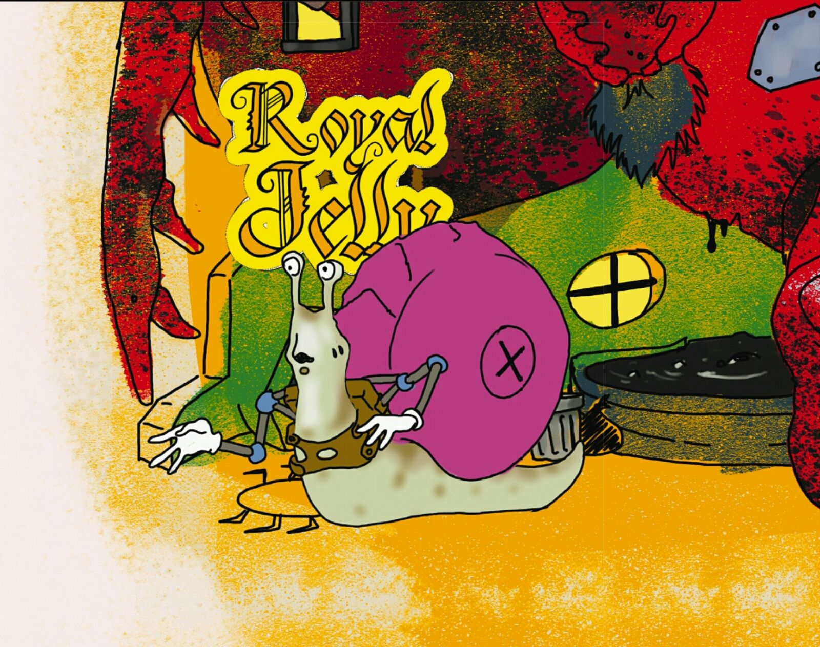 A piece of Gabriel Hernandez's art from the Motel Zotel.
Go Without
You can ignore the haters and just go without. Make the pages smaller, make the layout denser, use the space to play more with the text. In the case of Motel Zotel we have three illustrations of puddle people, but only one by Midjourney.
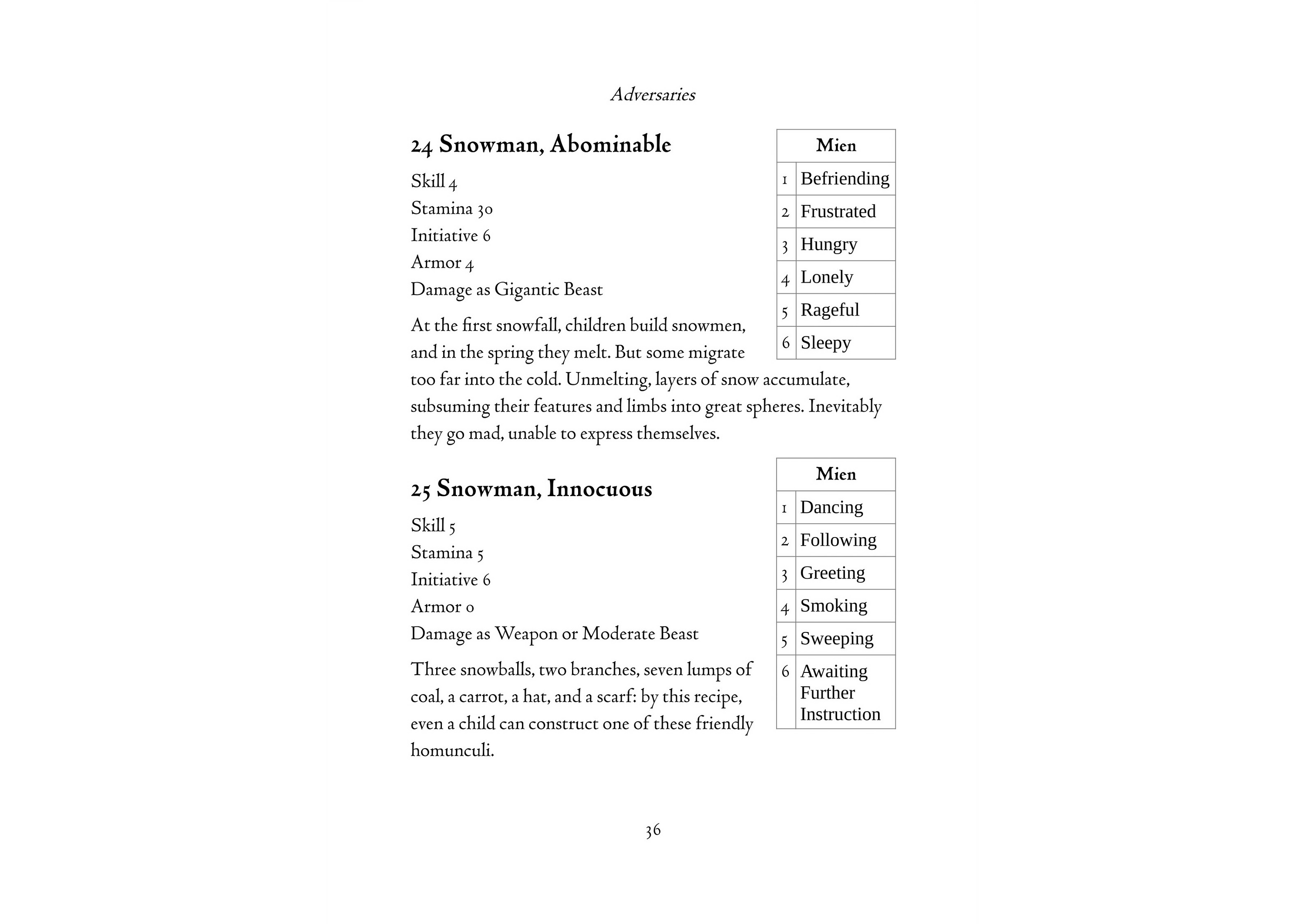 A page from my own book, combining two adversaries on one page. Smarter layout can maximize the use of limited art resources without looking bare.
Keep Using AI
Maybe you prefer the way Midjourney looks. You could just go for it! I have seen some impressive outputs from Midjourney when they are aimed at a spceific aesthetic or have a lot of odd details, and the technology is always improving.
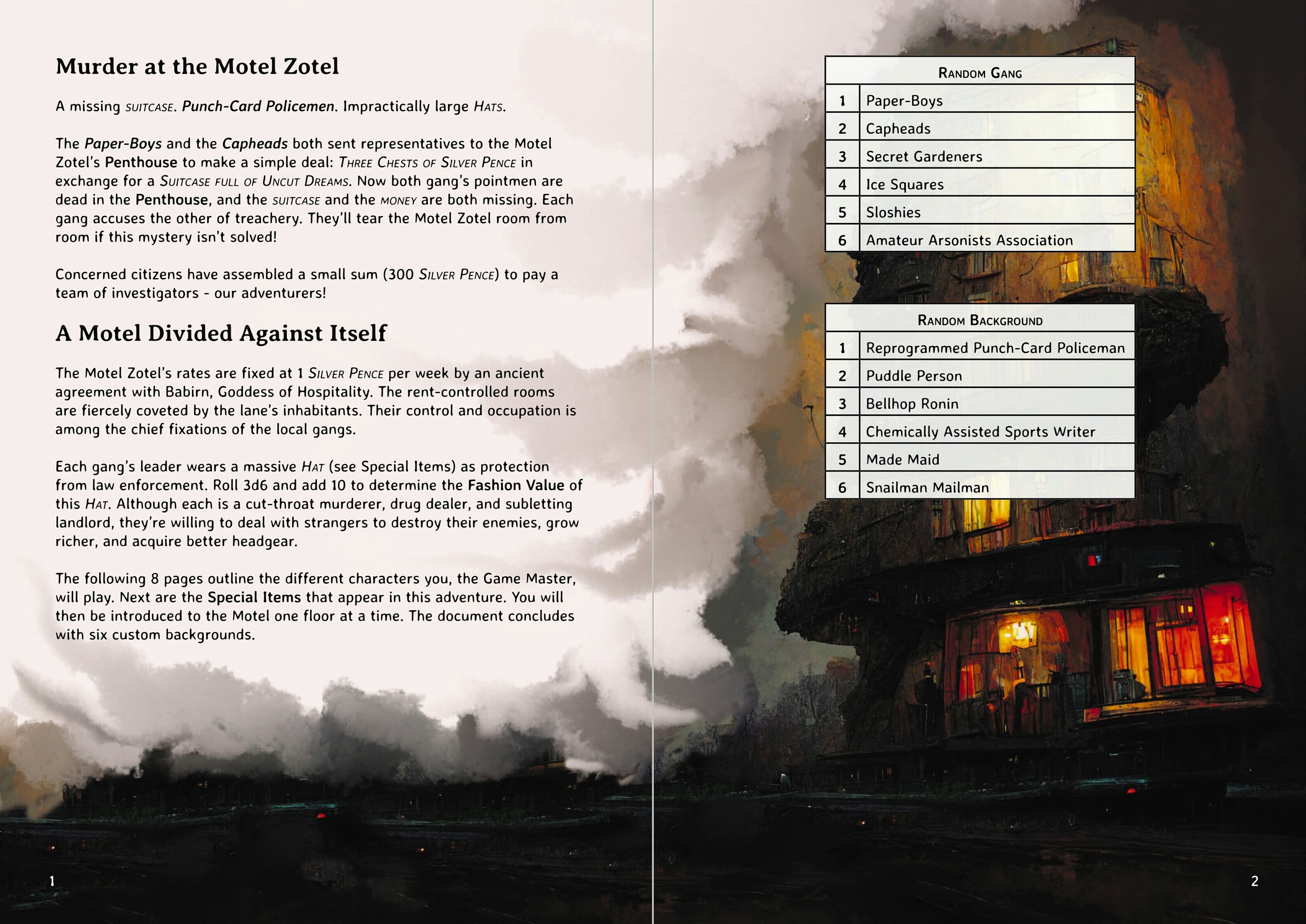 I actually don't mind this AI-art spread from the Motel Zotel.
Use Public Domain Art
This isn’t necessarily easier! For every wound man that everyone has seen before, there are hundreds of old book illustrations and antique paintings and forgotten comic book panels, waiting to be found and cleaned up and put to good use. It’s a tried-and-true element of the DIY and OSR scenes and there are many resources devoted to helping authors find good stuff.
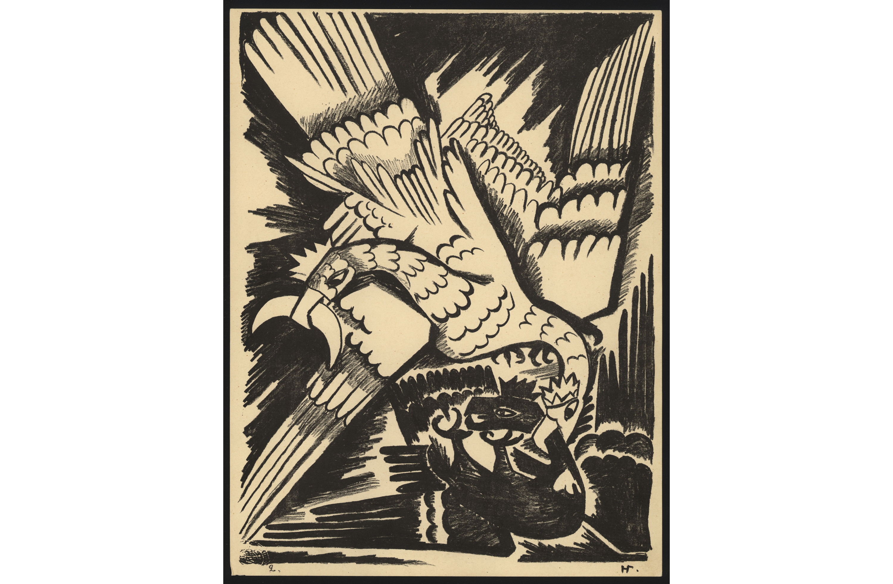 A page from Mystical Images of War, some public domain art.
Learn to Draw
You don’t have to draw well to draw adequately, and there’s some charm to a doodled illustration. Anyone can draw a stick figure and, with a little practice, make it expressive.
Collage
I’ve mentioned in the past my respect for the public-domain collages of Johnstone Metzger. Since then, the collages of Johan Nohr for Into the Odd and Mörk Borg have popularized the style.
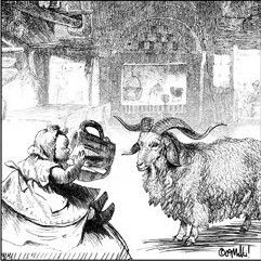 David Malki!, inspired by Scott McCloud, assembled his first comics from clip-art CDs.
Mix and Match
Personally, I don’t have a problem with AI as a tool or component of a larger process. I think something was lost (for these purposes) when AI art got too realistic, but I can imagine using it as a first step to be traced over or a component in a larger collage.
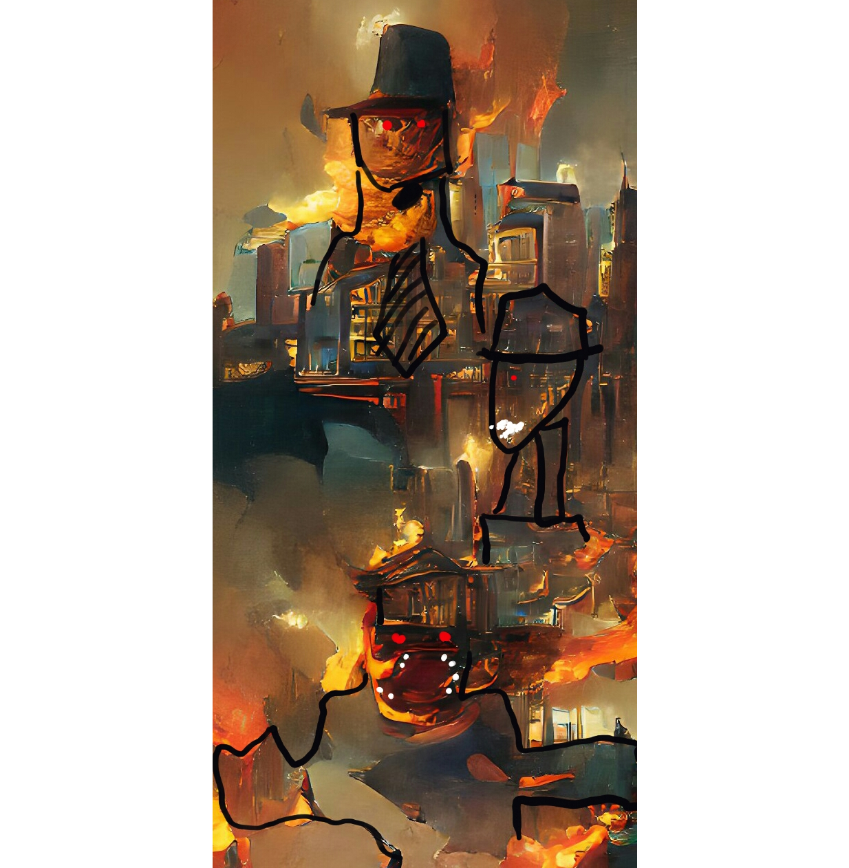 A rough attempt to refine an early Wombo.AI art. It's not my finest, but it's a proof-of-concept.
